Creating a wedding table at Battle Abbey starts with a real-world question. What will still look right once your ideas leave the mood board and sit inside the Abbot’s Hall, against the Duke’s Library panelling, or out on the Top Terrace with the East Sussex light shifting by the hour? Rooms with this much age and character expose weak styling decisions quickly. Tables that feel balanced in a showroom can read sparse in a great hall or overworked beside ancient stone.
The table matters because guests spend time with it. They notice the linen before the speeches begin, the candlelight as evening settles, the flowers in every photograph, and the place setting each time they sit back down. At Battle Abbey, those details need to do two jobs at once. They should feel considered for your wedding, and they should sit comfortably within the Abbey’s history rather than competing with it.
There is a practical way to approach that. Medieval dining in Britain often used long trestle tables in grand rooms, with objects such as the salt cellar carrying social meaning, a custom that still echoes in modern top-table planning, as outlined in this history of table setting traditions. That does not mean copying the past exactly. It means using the room as a guide. Heavy timber, stone, old libraries, and open terraces all ask for different amounts of colour, height, texture, and candlelight.
That is the thread running through these ideas. They are designed for Battle Abbey’s three very different settings, with practical notes on sourcing, guest-count trade-offs, and where certain details photograph best. If you are gathering references for richer woven textures before choosing runners or layered linens, couples often explore Spark Blank Textiles blankets to get a sense of pattern, weight, and colour direction.
A good scheme here feels romantic, grounded, and usable. It should hold its own in the room, flatter the season, and still leave enough space for plates, glassware, serving, and conversation.
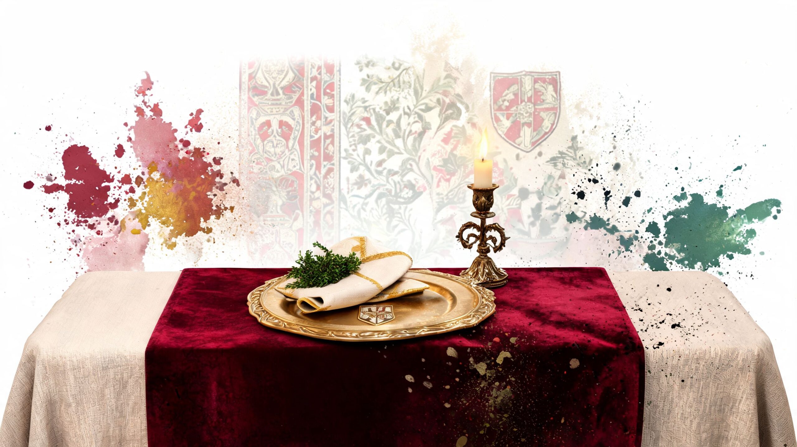
1. Historic Tapestry & Medieval-Inspired Table Settings
If you want the room to feel immediately connected to the Abbey’s Norman and medieval character, start with fabric. Not flowers. Not chargers. Fabric sets the historical tone fastest, especially in the Duke’s Library where wood panelling already gives you depth and gravity.
A tapestry-style runner in garnet, forest, navy, or antique gold works well because it adds weight without needing oversized centrepieces. Velvet ribbons on menus, heraldic motifs on table names, and aged-metal candle holders all support the mood. The mistake couples make is pushing this too far into costume. Once every surface shouts “medieval”, the room stops feeling elegant and starts feeling themed.
Here’s the look that tends to work best near ancient stone and dark timber:
- Choose one historic cue: Use either a tapestry runner, heraldic stationery, or goblet-style glassware as the hero.
- Keep florals restrained: Looser flowers in softened tones stop the table from feeling theatrical.
- Let the room do some work: In the Duke’s Library, the panelling already provides richness, so your linens can be simpler than they’d need to be in a blank marquee.
A tactile layer can help here. Couples looking at woven textiles often like to explore Spark Blank Textiles blankets for inspiration because the texture and pattern direction translate well into runner ideas and lounge styling.
What works in Battle Abbey
For larger wedding breakfasts, this style suits long refectory arrangements and top-table formats particularly well. Historic venues still carry echoes of the older top-table layout with wings, so a medieval-leaning scheme feels natural rather than imposed.
Practical rule: Use history as texture, not as costume. One or two medieval references feel intentional. Five or six feel heavy.
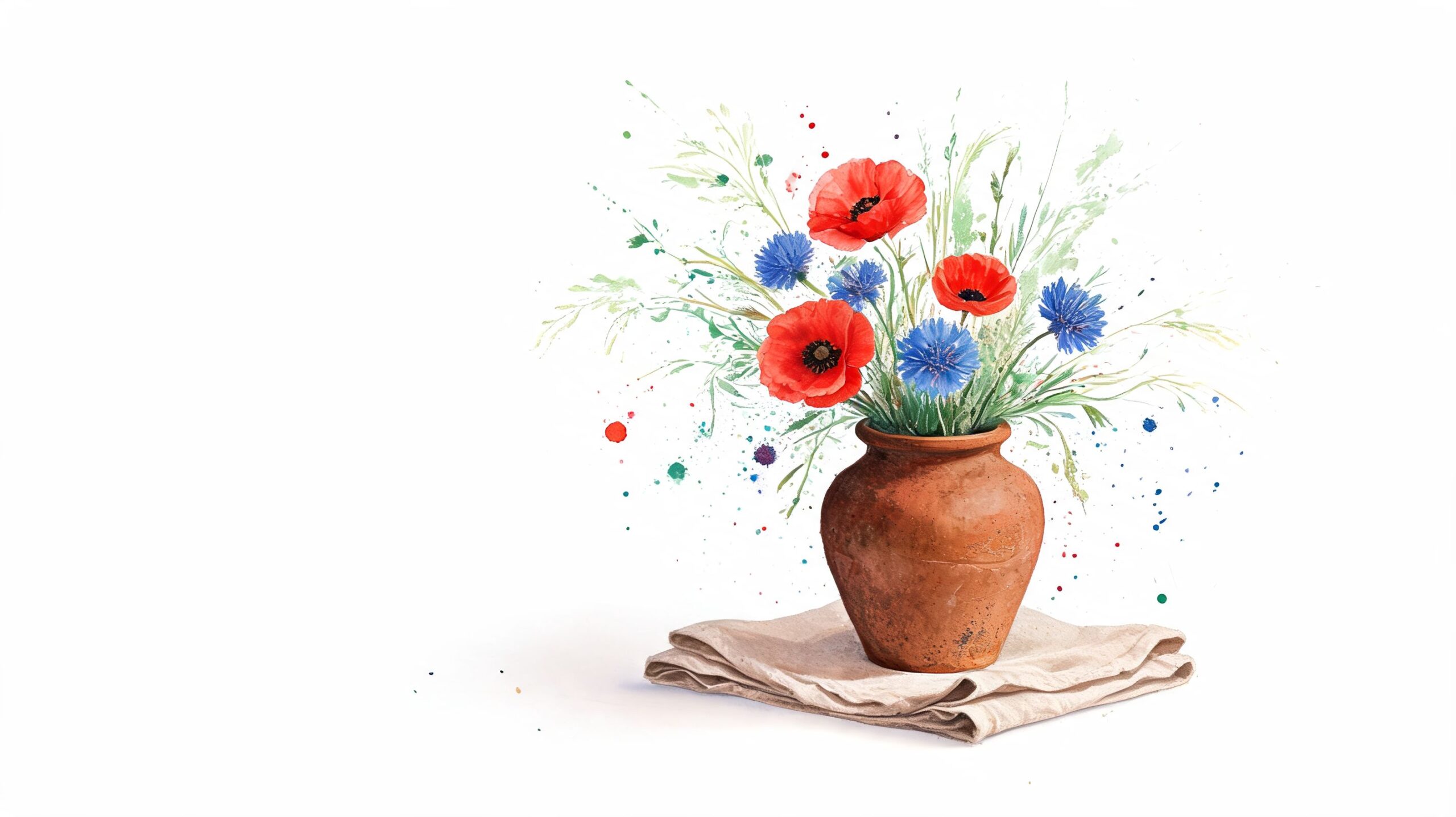
2. Botanical & Wildflower Arrangements with Local East Sussex Foliage
Guests usually feel this style before they name it. They cross the grounds, take in the stone, the lawns, the open sky, then sit down to a table that feels as if it belongs in the Abbey rather than being brought in for the day. That sense of fit matters at Battle Abbey, especially when the celebration moves between the Abbot’s Hall, the Duke’s Library, and the Top Terrace.
The strongest botanical tables here use restraint. East Sussex foliage, meadow flowers, herbs, seed heads, and lightly structured stems sit more comfortably against ancient masonry and dark timber than tightly packed imported blooms with a glossy finish. I’d rather see cow parsley texture, trailing ivy, rosemary, and yarrow used with confidence than a centrepiece trying to include every flower a wholesaler has available.
This approach also solves practical problems. Lower, airier arrangements are easier to talk across, easier to transport between ceremony and dinner spaces, and less likely to look crushed in the wind on the terrace. In the Duke’s Library, they stop the tables from feeling too heavy against the panelling. In the Abbot’s Hall, they soften the scale of the room without competing with it.
Styling it for Battle Abbey’s spaces
The Top Terrace needs movement. Use arrangements with an irregular outline so they still look graceful if a breeze shifts the stems. Compact domes tend to read flat outdoors, and they can block the very view guests came outside to enjoy.
A few choices consistently work well here:
- Use vessels with age and texture: Terracotta, smoked glass, weathered ceramic, and softened metal sit naturally with the Abbey’s stone.
- Keep centrepieces low for outdoor dining: Guests should be able to see each other, and the terrace line should stay visible in photographs.
- Repeat foliage across the day: If the canapés tables, welcome display, and wedding breakfast share the same botanical ingredients, the design feels intentional rather than pieced together.
- Edit by guest count: Smaller weddings can carry more delicate stem-by-stem styling. Larger guest counts usually need simpler ingredients repeated well, so the look stays consistent table to table.
For sourcing, local matters most when it shows in the palette. Spring can take softer greens, blossom tones, and hedgerow texture. Late summer and early autumn suit grasses, scabious, dahlias, herbs, and deeper foliage. Ask your florist what is cutting well in East Sussex that week, then build from that list instead of starting with a Pinterest image and forcing the season to match it.
One trade-off is worth being clear about. True wildflower styling looks relaxed, but it is not casual to execute. It needs disciplined colour editing and careful spacing, otherwise the tablescape slips from airy to messy. Commit to a small family of ingredients and let the room, the ruins, and the view provide the richness.
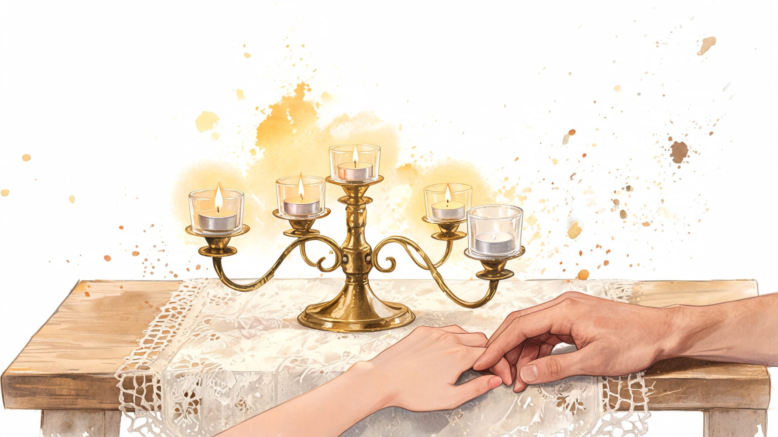
3. Candlelit Intimate Ambiance with Vintage Candelabra & Tea Lights
As dusk settles over Battle Abbey, candlelight changes each space in a different way. In the Duke’s Library, it draws out the depth of the wood and stops the room feeling too heavy. In the Abbot’s Hall, it adds softness against the stone. On the Top Terrace, it catches the last light and gives evening photographs a warmer edge.
Good candle styling depends on scale, not just romance. A single tall candelabrum can look impressive on a long banquet table, but if nothing happens below that top line, the table feels sparse in person and flat in photographs. Build light at three levels instead: one taller focal point, a middle layer of shorter candlesticks or bud vases, and a low scatter of tea lights or votives. That structure works particularly well at Battle Abbey because the rooms already have strong architectural height. The table needs light closer to the plate to feel finished.
Historic interiors suit candlelight because the materials respond well to it. Brass warms old timber and cream stone. Silver, pewter, and blackened metal give a crisper look that suits a more formal dinner setup in the Duke’s Library. If linens are part of the plan, the way fabric holds and reflects candlelight matters too. This guide to understanding sewing fabric options is useful when comparing the softer drape of linen with the cleaner finish of cotton.
Choose flame or LED based on the room, not sentiment
A common misstep for couples involves real flame candles. Real flame is beautiful, but it only works if the candles stay steady, the service team can move safely, and the venue rules allow it. Indoors, sheltered tables with proper holders usually justify real wax. On the Top Terrace, exposed wind can turn that same idea into constant relighting, wax marks, and uneven photos.
For Battle Abbey, I’d usually suggest this split:
- Duke’s Library: Vintage candelabra with real flame, if permitted, plus low tea lights to fill the table.
- Abbot’s Hall: Mixed candlesticks and enclosed votives so the glow feels generous without blocking sightlines.
- Top Terrace: High-quality LED candles in hurricane sleeves or storm holders, especially for later service and speeches.
Candlelight should support the evening, not create work for the venue team or distractions for guests.
A few practical rules keep the look convincing:
- Use unscented candles only: Fragrance competes with the meal.
- Keep metals consistent within each table: Mixed finishes can work across the whole room, but one table needs a clear story.
- Match the table length to the candle rhythm: Long trestles need repeated pools of light. Round tables need a tighter central cluster.
- Check sightlines at seated height: What feels delicate while standing can obstruct conversation once everyone is at the table.
For smaller guest counts, candlelight can carry more of the design because each table gets attention and spacing. For larger weddings, simplify the ingredients and repeat them exactly. Five well-chosen candle elements used consistently across twenty tables will read far better than twenty slightly different interpretations.
4. Monochromatic Elegant Table Linens with Textural Layering
A single-colour palette can be more striking than a multicolour one, especially inside the Duke’s Library where the architecture already gives you contrast. Ivory on ivory, stone on putty, or moss on deeper olive can feel expensive and calm without trying too hard.
This approach depends on texture. If every surface is the same finish, monochrome turns flat. You need contrast through weave, weight, transparency, and edge detail. Crisp base cloth, softer overlay, heavier runner, and folded napkin with a distinct hand feel. That mix creates depth even when the colour barely shifts.
Victorian table dressing treated linens as an art form, with starching, pressing, lace edges, and folded napkins used to signal occasion and care. That history still informs why layered cloth matters so much in formal rooms.
The fabric choices matter more than the shade
When couples build this look, I’d pay closer attention to fibre and finish than to exact colour matching. Linen gives softness and movement. Cotton can feel neater and more structured. Velvet works best as an accent, not as the whole story. If you’re comparing materials, this guide to understanding sewing fabric options is useful for seeing how linen and cotton behave differently.
A few combinations that usually land well at Battle Abbey:
- Stone cloth with lace or voile overlay: Romantic in the Abbot’s Hall.
- Ivory base with taupe napkin and velvet runner: Rich enough for the Duke’s Library.
- Deep olive with matte ceramics: Strong for autumn dinners without relying on bright flowers.
What doesn’t work is over-layering every element. Too many fabrics can make place settings feel congested, particularly on round tables where glassware, bread plates, and menus already need room.
5. Seasonal Colour Palettes Reflecting the East Sussex Landscape
Guests step into Battle Abbey with the season already set around them. The lawns, stone, sky, and trees have done half the styling work for you. The table palette should pick up that cue so the room feels rooted in the place rather than decorated in isolation.
At this venue, colour works best when it responds to both architecture and outlook. The Abbot’s Hall can carry richer, weightier tones because the stone and timber give them something to push against. The Duke’s Library suits more restrained colour stories, especially those built from parchment, moss, claret, ink, and old gold. On the Top Terrace, pale shades need enough definition to hold their own in open daylight, so washed-out neutrals often need a darker accent or a stronger floral note.
Season helps narrow the choices quickly.
Spring usually suits soft greens, hawthorn white, pale blue, butter, and blossom pink. In the Abbot’s Hall, I would keep those colours grounded with natural wood, antique brass, or smoke-coloured glass so they do not feel too sweet. On the Top Terrace, that same palette reads beautifully in photographs because it echoes the fresh greens and softer East Sussex light.
Summer has more flexibility, but historic rooms still reward restraint. Cream, oat, sage, dusty rose, hedgerow green, and muted cornflower blue tend to sit comfortably against old stone. Bright tropical mixes can fight the setting unless they are used in a very controlled way, usually through flowers rather than every table element.
Autumn is the easiest season to get right here. Rust, damson, berry, ochre, olive, and burnished gold all belong naturally beside the Abbey’s masonry and darker interiors. If you are working in the Duke’s Library, autumn colour can be especially effective on smaller guest counts, where deeper tones make the room feel intimate rather than sparse.
Winter allows the strongest contrast. Forest green, oxblood, midnight blue, charcoal, ivory, and antique metallics work well under candlelight, especially in the Abbot’s Hall. The trade-off is that very dark palettes need enough reflection from glassware, candles, or polished cutlery to stop the table from feeling heavy.
A reliable way to build the palette is to choose in three passes:
- Start with the month: Use the hedgerows, fields, skies, and garden tones already present in East Sussex.
- Check the room: Match those colours against stone, oak, bookshelves, or terrace views.
- Add one personal note: Bring in a single shade with meaning to you, then repeat it sparingly in napkins, stationery, or florals.
That order keeps the scheme believable.
It also helps with sourcing. Seasonal flowers and foliage are usually easier to find locally, often hold up better on the day, and tend to feel more convincing in the space than imported stems chosen only for colour match. If a couple wants a very specific shade that is out of season, I would usually place that colour in the linen, taper candles, or stationery first, then let the flowers stay closer to what the month naturally offers.
The result is more confident, and far more in keeping with Battle Abbey itself.
6. Statement Charger Plates & Personalised Dinnerware
If florals are light and linens are quiet, charger plates can carry the visual weight. They frame each setting, reflect candlelight, and make a table feel complete before the first course arrives. This is especially helpful in larger receptions where guests read the room from a distance before they notice smaller details.
Mirrored, brushed metallic, scalloped ceramic, or subtly monogrammed chargers all work at Battle Abbey, but they need to suit the architecture. Highly glossy, ultra-modern acrylic can look out of place against old stone. Aged gold, pewter, cream glaze, and darker metallics tend to sit more naturally in the setting.
Where personalised pieces help most
Personalisation works best when it’s restrained. A monogram on the menu, a crest-inspired motif, or a charger in your chosen metal can be enough. Fully printed novelty plates often distract from the overall composition, and they can make formal dining service feel less polished.
This is also where coordination with catering matters. Chargers, bread plates, wine glasses, and service plates need to work together physically, not just visually. If the stack is too tall or the charger too wide for the table plan, the room starts to feel cramped.
One detail couples often love is keeping a single personalised place setting after the wedding. It gives the custom element a second life without requiring every table piece to become a permanent purchase.
7. Mixed Metallic Accents & Candlestick Variety
As dusk settles over Battle Abbey, metal starts doing work that flowers cannot. Brass catches the candlelight, pewter softens dark timber, and silver gives old stone a clean edge in photographs. Used well, mixed metallics bring depth to the table without fighting the building itself.
The key is restraint. In rooms with this much architectural character, one metal should lead and the second should play a supporting role. Antique gold and pewter suit the Duke’s Library particularly well because they sit comfortably with the darker joinery and book-lined walls. In the Abbot’s Hall, aged brass with soft silver usually feels more settled against the scale of the room. Rose gold can work, but only in small touches such as votives or a slim candleholder. Too much of it starts to feel disconnected from the Abbey’s older surfaces.
Candlesticks matter as much as the finish.
A table of identical holders can look flat, especially in long banquet layouts. I usually vary the height and silhouette while keeping the metal palette disciplined. For example, taller brass sticks at the centre, shorter pewter holders toward the ends, and a few low metallic votives to pull the light down to guest level. That approach gives movement across the table and helps larger setups feel less rigid.
A practical rule keeps this style under control:
- Choose one dominant metal: Usually the finish that appears on the largest pieces.
- Repeat the secondary metal in two or three places: Candlesticks, votives, napkin details, or small trim.
- Match the metal to the room’s weight: Heavier, older finishes suit the Abbey better than polished, mirror-bright ones.
- Check the light at the actual time of day: Metals that look subtle at noon can glare once candles are lit.
Guest count affects the balance too. On smaller tables in the Top Terrace, too many metallic elements can feel busy because the light is clearer and the setting already has visual interest from the surrounding gardens and East Sussex sky. In larger indoor receptions, the extra reflection helps the tables read from across the room and keeps the scheme from disappearing into stone and oak.
This is also one of the easiest places to create a strong photo-op without adding more volume. A run of mixed-height candlesticks down a feast table in the Abbot’s Hall photographs beautifully from the doorway. In the Duke’s Library, a round table with silver and brass accents near the shelves picks up enough glint to feel rich without looking staged.
The eye accepts mixed metals quickly when the placement is deliberate. Random shine still looks random, no matter how expensive the pieces are.
8. Formal Place Cards, Seating & Table Literature
Guests notice the paper before the first course arrives. In rooms as characterful as the Abbot’s Hall and Duke’s Library, that matters. A flimsy place card or generic table number can look out of place against old oak, stone, and candlelight, while well-made paper goods help the whole table feel considered.
The best schemes at Battle Abbey treat place cards, menus, table names, and any short welcome note as part of the tablescape, not separate admin. Weight, finish, and scale do more work than ornament. Heavy stock, restrained calligraphy, blind embossing, wax seals, and ribbon ties all suit the setting, but only when the details are edited. Too many decorative flourishes can tip historic into theatrical very quickly, especially in the Duke’s Library where guests are already surrounded by visual texture.
Practicality still leads.
A guest should be able to find their seat at a glance, lift the menu easily, and read it in low evening light without turning it toward a candle. Script-heavy fonts often fail that test. I usually advise couples to keep the guest name in the more decorative style and set everything else in a clean serif, so the piece still feels formal but works under real reception conditions.
Guest count changes the approach. On larger tables in the Abbot’s Hall, a folded menu or place card with enough height to read across the setting helps the table hold its shape visually. On smaller rounds or terrace dining setups, flatter paper pieces often look better because they do not crowd glassware, bread plates, and flowers.
A simple framework keeps the suite coherent:
- Repeat one paper stock or finish across everything: Menus, place cards, and table numbers should share a clear visual family.
- Build in a contingency plan: Keep spare cards, matching ink, and a few blank menus ready for last-minute seating changes or dietary edits.
- Size pieces to the table: Larger feasting layouts can carry tented cards or layered menus. Smaller tables usually need cleaner, lighter pieces.
- Use table literature selectively: One menu and one place card per setting is often enough. Extra inserts, poems, timelines, and drink notes can make the table feel crowded.
The Top Terrace benefits from a lighter hand. That setting already has the East Sussex sky, gardens, and long views doing part of the visual work, so crisp paper, softer colour, and simpler shapes tend to sit better than heavily embellished stationery. Indoors, richer finishes and deeper ink colours read more clearly against the Abbey’s darker materials.
There is also a strong photo opportunity here. Escort cards or a seating display placed near an old doorway, library shelves, or a terrace entrance can become part of the arrival experience rather than a separate sign guests rush past. Inside the reception itself, a beautifully set place card, menu, and napkin combination gives photographers a close-up detail shot that feels true to the venue, rather than generic wedding styling.
The best table literature at Battle Abbey feels personal, legible, and properly placed. If every paper element looks related, the whole room feels calmer and more polished.
9. Statement Floral Centrepieces with Height Variation
Guests step into the Abbot’s Hall, look down the tables, and the flowers should guide the eye to the room itself, not fight it. At Battle Abbey, scale matters more than sheer size.
Tall centrepieces suit the venue, but only in the right positions. I usually reserve height for tables on the room’s edge, for ends of long banquet layouts, or for spots that frame an entrance and photograph well from across the room. In the middle of the plan, lower arrangements do a better job. Guests can talk easily, candles stay visible, and the architecture still reads in the background.
The room should have a pattern, not a contest.
In the Abbot’s Hall, that often means a clear alternation of high and low pieces so the eye moves comfortably along the tables. In the Duke’s Library, I would be even stricter. Shelving, darker finishes, and a more enclosed feel can make heavy florals seem crowded very quickly, so slimmer compotes, footed bowls, or raised designs with plenty of open stem structure tend to work better than dense rounded masses. On the Top Terrace, wind changes the calculation again. Height can be beautiful there, but it needs weight at the base and mechanics your florist trusts outdoors.
A visual reference helps when discussing this with your florist:
Drama without blocked conversation
Use height that rises through negative space. Flowering branches, foxgloves, delphiniums, meadow-style lines, and lighter urn arrangements usually perform better here than one solid dome of blooms sitting at eye level. The practical rule is simple.
Go tall where guests look past the arrangement. Go low where guests need to look through it.
For larger guest counts, mixed centrepiece schemes are usually the safer choice. One table might carry a raised arrangement, the next a cluster of bud vases and candles, the next a medium compote. That approach stretches the floral budget, eases setup, and keeps the room from feeling visually heavy. It also gives your photographer more than one table story to capture, which matters in a venue with this much character.
If couples want a strong photo-op, I would put the most architectural arrangement where it can be seen on arrival or against one of the Abbey’s strongest backdrops, not necessarily on every guest table. A tall piece near a doorway in the Abbot’s Hall, a library-side table in the Duke’s Library, or a terrace table with the East Sussex view behind it will usually earn more attention than repeating the same large design across the whole room.
If you are choosing between one oversized arrangement per table and a layered mix of heights, the layered mix is usually the better call at Battle Abbey. It looks more considered, works harder with the building, and causes fewer practical problems during dinner service.
10. Vintage & Heirloom Linens with Lace Overlays
A table dressed in older textiles suits Battle Abbey for an obvious reason. The rooms already carry age, texture, and patina. Linen with a softened handle, a lace runner with slight irregularity, or embroidered napkins inherited from family reads as part of the setting rather than decoration dropped in for the day.
Used well, this style brings warmth to the Abbey’s stone, timber, and formal interiors. It is especially effective in the Duke’s Library, where close candlelight and darker finishes reward finer detail, and in the Abbot’s Hall, where a long banquet setup can feel more personal with layers that break up large expanses of table. On the Top Terrace, though, I would use lace more sparingly. Wind catches light overlays quickly, and bright sun can flatten delicate pattern unless there is enough contrast underneath.
Restraint matters.
The common mistake is stacking too many nostalgic pieces on one table. Heavy lace cloths, ornate chargers, frilled napkins, and decorated chairs all compete. A better approach is one hero textile and one supporting layer. For example:
- A plain flax or ivory base cloth with a narrow lace runner: Clean, period-aware, and easy to style for larger guest counts.
- Heirloom napkins with simple glassware and plain crockery: Lets the craftsmanship show without pushing the table into costume territory.
- Tea-stained or off-white linens instead of brilliant white: Usually sits more comfortably against historic interiors and candlelight.
There is also a practical side couples often underestimate. Older linens need pressing, pinning, and careful placement, particularly if sizes vary from piece to piece. I always allow extra setup time for heirloom cloths because they rarely behave like standard hire linen. Some are slightly uneven, some crease easily, and some show best only once the room lighting is set. That extra hour of styling can be the difference between romantic and untidy.
For sourcing, the best results usually come from mixing family pieces with a small amount of specialist hire stock rather than trying to find enough true vintage linen for every table. Reserve the most detailed cloths for the top table, cake table, or a signing setup, then use plainer coordinated linen across guest tables. That protects fragile pieces, keeps the budget in line, and creates a few stronger photo moments inside the Abbey instead of spreading delicate items too thinly across the whole reception.
This look is at its strongest for intimate dinners, layered autumn receptions, and weddings that want history to feel lived-in rather than staged.
10-Style Table Decor Comparison
| Style / Theme | Implementation Complexity 🔄 | Resources & Lead Time 💡 | Expected Outcomes ⭐📊 | Ideal Use Cases | Key Advantages ⚡ |
|---|---|---|---|---|---|
| Historic Tapestry & Medieval-Inspired Table Settings | High, specialist sourcing and coordination; careful balance to avoid costume-like feel 🔄 | High resources: tapestry fabrics, period tableware; book specialists ≥6 months 💡 | ⭐⭐⭐⭐ · Cohesive historic narrative and strong photographic appeal 📊 | Destination/period weddings, 75–250 guests, venue-led historic events | High visual authenticity and venue complement; strong storytelling payoff ⚡ |
| Botanical & Wildflower Arrangements with Local East Sussex Foliage | Moderate, seasonal planning and supplier coordination 🔄 | Low–Moderate: local florists, foraging; best 2–12 weeks lead time 💡 | ⭐⭐⭐ · Natural, sustainable look that complements grounds 📊 | Spring/summer outdoor terraces, intimate ~60 guests, eco-minded couples | Cost-effective, sustainable, fast in-season implementation ⚡ |
| Candlelit Intimate Ambiance with Vintage Candelabra & Tea Lights | Moderate–High, safety planning and candle management required 🔄 | Moderate: hire candelabra, staff for monitoring; LED backup recommended, reserve 4–8 weeks 💡 | ⭐⭐⭐⭐ · Strong romantic atmosphere and emotional impact 📊 | Evening receptions, Duke’s Library dinners, intimate romantic events | Immediate mood transformation; high emotional/photographic payoff ⚡ |
| Monochromatic Elegant Table Linens with Textural Layering | Low–Moderate, sourcing quality linens and layering strategy 🔄 | Moderate: high-quality rentals preferred; book 2–6 weeks ahead 💡 | ⭐⭐⭐⭐ · Clean, timeless aesthetic; highlights centrepieces and photography 📊 | Formal banquets, 200+ guests, photography-focused receptions | Versatile, scalable, allows other elements to stand out; easy to implement ⚡ |
| Seasonal Colour Palettes Reflecting the East Sussex Landscape | Low, palette selection and seasonal coordination 🔄 | Low–Moderate: seasonal flower sourcing; coordinate 3–4 months prior 💡 | ⭐⭐⭐ · Authentic, cohesive connection to landscape; cost savings via seasonality 📊 | Outdoor-focused receptions, destination weddings, 75–250 guests | Simplifies design choices; aligns décor with natural setting; cost-effective ⚡ |
| Statement Charger Plates & Personalised Dinnerware | Moderate–High, custom design and logistical coordination 🔄 | High: bespoke or rental costs, 8–12 weeks lead time; possible per-piece purchase 💡 | ⭐⭐⭐⭐ · Highly personalised, memorable table presentation 📊 | Formal banquets, couples with larger budgets, keepsake-focused events | Strong sense of luxury and personalization; high photographic impact ⚡ |
| Mixed Metallic Accents & Candlestick Variety | Moderate, careful mix to avoid visual clutter 🔄 | Moderate: varied rentals and polishing; coordinate styles and distribution 💡 | ⭐⭐⭐⭐ · Luxurious depth and dynamic reflections under light 📊 | Contemporary/formal weddings, photography-focused dinners | Adds luxury without bold colour; flexible styling; quick to deploy via rentals ⚡ |
| Formal Place Cards, Seating & Table Literature | High, significant calligraphy/printing effort and coordination 🔄 | Moderate–High: professional calligrapher or printer; allow 4–8 weeks plus backups 💡 | ⭐⭐⭐ · Elevated guest experience and polished table detail 📊 | Large formal events (150–250), multi-course banquets, black-tie affairs | Enhances guest personalization and perceived care; strong detail-oriented impact ⚡ |
| Statement Floral Centrepieces with Height Variation | High, specialist floristry, logistics for sightlines and stability 🔄 | High: premium flowers, tall stands, specialist florist; book 4–6 months 💡 | ⭐⭐⭐⭐ · Dramatic focal points and strong photographic statements 📊 | Grand celebrations (150–250), high-budget weddings, indoor Duke’s Library dinners | Immediate dramatic visual impact; defines space and frames photography ⚡ |
| Vintage & Heirloom Linens with Lace Overlays | High, sourcing antique pieces and careful handling/storage 🔄 | High: specialist rentals, condition checks, reserve 6–8 months 💡 | ⭐⭐⭐⭐ · Timeless, romantic authenticity and period-appropriate texture 📊 | Romantic/vintage-inspired intimate weddings (~60 guests), fairy-tale aesthetics | Genuine historical feel and exceptional romance; pairs well with candlelight ⚡ |
Bringing Your Vision to Life at Battle Abbey
Guests step from the stone cloisters into candle glow, old timber, and long tables that need to feel as though they belong there. At Battle Abbey, strong table design starts with reading the room properly. The Abbot’s Hall can carry ceremony and structure. The Duke’s Library suits warmer, more layered dinner styling. The Top Terrace needs pieces that hold their shape in open air and still photograph well against the wider setting.
Good results come from fit, not excess. A 50-guest dinner gives you space for finer finishing details, generous place settings, and quieter moments between centrepieces. A larger wedding needs repeatable ideas that can be installed quickly, reset cleanly, and still look intentional from every angle of the room. I usually advise couples to choose two or three hero details, then keep the rest disciplined. At a historic venue, restraint often looks more confident than trying to dress every inch.
Practical choices matter just as much. In enclosed rooms, heavily scented flowers and pollen-heavy stems can become a problem for guests, particularly over a long meal. Lower-allergen options such as herbs, foliage, fruit, glass vessels, and unscented candles are often easier to live with and easier for staff to maintain during service. Shorter arrangements also reduce the risk of blocked sightlines, wax catches better on stable surfaces, and lighter pieces are simpler to reposition if the table plan changes late.
Digital mock-ups can help with planning, but they should confirm decisions, not make them for you. Sample the linen in the actual light. Test candle height against the panelling. Stand in the photographer’s position before signing off a tall centrepiece. This guide to professional table tops is useful for understanding how surface materials, edges, and proportions affect cloth drape, place setting spacing, and the stability of decor hired in for a one-day installation.
Battle Abbey Weddings is one relevant option for couples who want historic character with practical planning support. With ceremonies in the Abbot’s Hall, wedding breakfasts in the Duke’s Library or Dining Room and Bar, outdoor receptions on the Top Terrace or Six Penny Lawn, and setup access the day before subject to availability, the venue gives you room to shape a scheme around guest numbers, catering style, and the photo opportunities each space naturally offers.
The strongest tables here feel considered rather than overworked. They borrow from the Abbey’s age, stone, timber, and East Sussex surroundings, then translate that character into details guests can enjoy throughout the meal.
If you’d like help turning these table decor ideas into a plan that fits the Abbot’s Hall, Duke’s Library, or Top Terrace, speak to Battle Abbey Weddings. Their team can help you match your styling choices to the venue’s historic spaces, guest numbers, catering format, and photo opportunities across the estate.