A spring palette that feels beautiful on a phone screen can look completely different once it is set against Battle Abbey's stone walls, old timber, and shifting outdoor light. I see this often with couples who have saved plenty of inspiration, then realise the colours they loved in isolation feel too sweet, too cold, or out of place once the venue enters the conversation.
Battle Abbey rewards palettes that respond to the building. The Abbot's Hall carries weight and texture. The Duke's Library asks for more restraint and depth. The Top Terrace can take fresher, lighter tones because the sky and garden edges do part of the styling for you.
That is why springtime wedding colours here need more than seasonal appeal. They need to suit the scale of the room, the warmth or coolness of the stone, the way candlelight changes colour after dusk, and the kind of flowers that are available in spring.
Soft blue, pink, green, and neutral foundations are often a strong fit for historic English venues, but the right choice depends on where each colour will sit and how hard you ask it to work. A palette for a ceremony in the Abbot's Hall should not be judged the same way as a drinks reception on the terrace.
If you are building moodboards, fabric swatches can help you test combinations before you commit. I often suggest looking at curated fat quarter sets for color matching because real materials show undertones, contrast, and texture far better than a screen.
The eight palettes below are chosen with Battle Abbey in mind, not as generic spring formulas. Each one suits a different mood, a different space, and a different level of contrast against the venue's history.
1. Soft Pastels & Blush
This is the palette couples reach for when they want spring to feel tender rather than sugary. Soft pink, cream, pale lavender and champagne sit beautifully inside Battle Abbey because they soften the age of the building without competing with it.
The stonework in the Abbot's Hall has enough texture and gravity of its own. Pale shades work there because they diffuse rather than dominate. A blush aisle arrangement, cream candles and champagne-toned linens let the room feel luminous instead of overly styled.
Where it works best at Battle Abbey
Use this palette in the ceremony first, then carry it lightly into drinks on the Top Terrace. It's especially effective if you want your photographs to feel airy and romantic against the ruins and garden edges.
For couples who love a classic English look, this is the closest route to that refined country-house feeling. Think silk ribbon, garden roses, soft taper candles, and floral arrangements that look gathered rather than rigidly formal.
Practical rule: If you're using several pale tones, add contrast through texture, not more colour.
That means lace overlays, silk runners, velvet lounge accents, or ribbed glassware. Without texture, a pastel scheme can flatten quickly in a large reception space.
What to do carefully
This palette can become too washed out if every surface is pale. Keep at least one grounding note in the room. At Battle Abbey, that might be the exposed wood, old stone, and natural greenery, so you don't need to force a darker accent.
A good balance often looks like this:
- Linens first: Keep tablecloths ivory or white, then bring in blush through napkins or runners.
- Metal second: Choose rose gold or champagne metallics instead of bright silver, which can feel cooler than the room wants.
- Flowers third: Use greenery sparingly so bouquets still feel soft rather than overly botanical.
For evening portraits, this palette shines on the Top Terrace when the light turns warmer. Pale pinks and champagnes catch that golden tone beautifully, while stronger colours can sometimes feel harsher against old stone.
2. English Garden Green & White
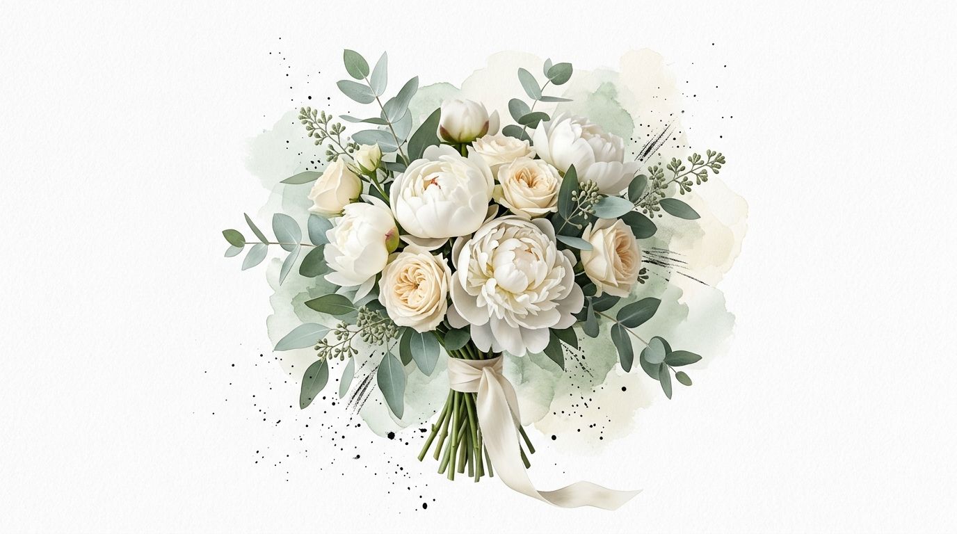
If Battle Abbey itself is the star, green and white is often the most elegant decision. It looks effortless, but that simplicity is exactly why it works so well in a heritage venue.
Fresh white florals, layered foliage, soft cream candles, and restrained styling give the architecture room to breathe. In a place with historic walls, carved details, and dramatic outdoor views, this palette rarely feels underdone. It feels confident.
Best spaces for this palette
The Duke's Library benefits from restraint. Too many competing colours can make a historic room feel busy. Green and white keeps the eye moving through the architecture, not getting stuck on decor.
Outside, this palette is ideal on the Six Penny Lawn and Top Terrace because it echoes the East Sussex natural setting rather than trying to outshine it. It also suits couples who want the celebration to feel seasonal and locally rooted.
For flower planning, cost and flower choice often go hand in hand with palette decisions. This guide on wedding flower costs is worth reviewing early, because foliage-heavy schemes can be both visually generous and easier to scale than highly specific floral palettes.
What works and what doesn't
This is a strong choice if you want abundance without fuss. Think potted herbs, ivy trails, clustered bud vases, meadow-style centrepieces, or long tables with foliage runners broken up by white blooms.
What usually doesn't work is forcing too much formality into it. Tight, symmetrical arrangements can make a green-and-white palette feel corporate. Looser movement suits Battle Abbey better.
Let the greenery do more of the visual work than the flowers.
That's especially true in spring, when the season itself already offers natural variation. You don't need to overfill every table if the room already has character. A cleaner scheme can feel more luxurious than one packed with stems.
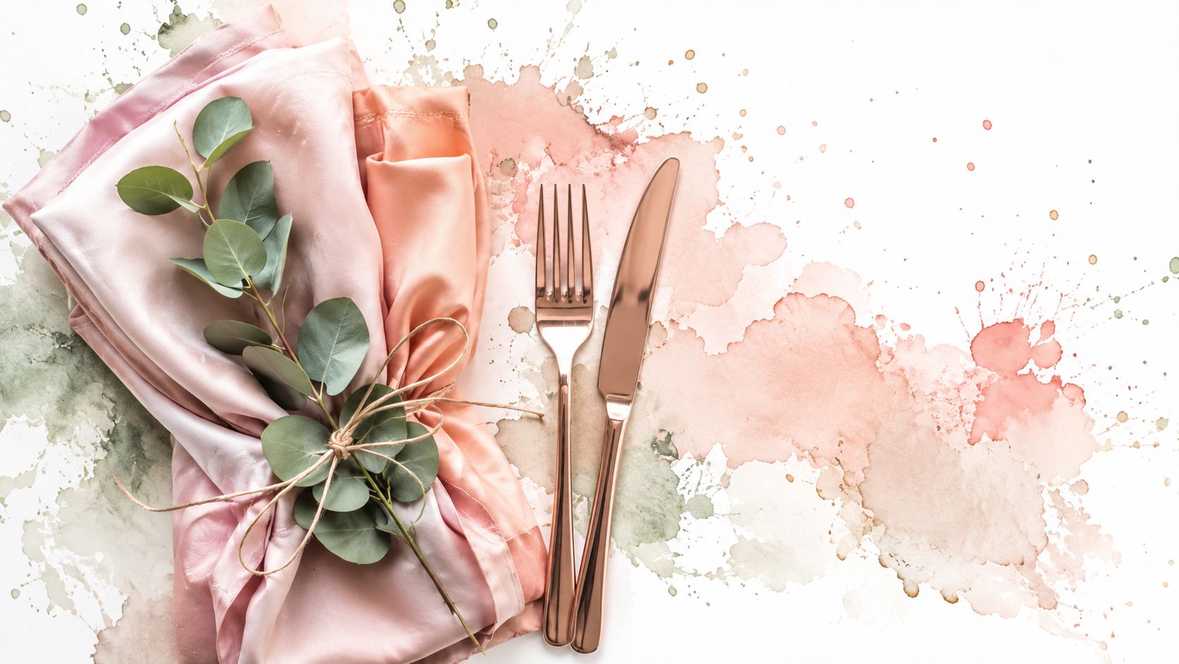
3. Blush Pink, Peach & Sage Green
This is one of the most adaptable springtime wedding colors combinations for Battle Abbey because it bridges old-world romance and modern softness. It's warmer than pure pastel, more interesting than blush alone, and gentler than brighter spring shades.
According to a 2026 London Fashion Week Spring/Summer projection from Pantone, blush pink and sage green are expected to dominate UK spring wedding colour trends, with a 34% increase in adoption among brides in Southeast England compared with 2024 in the Pantone trend report. That projection fits what many planners already like about this pairing. It photographs softly, reads well indoors, and still feels current.
A table built around these tones can look especially polished with peach florals, sage foliage, cream candles, and rose-gold details.
How to place the colours
In the Abbot's Hall, use sage in the ceremony arch or aisle foliage so the stone remains visible. Bring blush and peach into the flowers rather than large blocks of fabric. This keeps the palette romantic rather than overly sweet.
For the wedding breakfast, this palette works well when cream remains the base. Sage napkins, peach taper candles, blush menus, and mixed florals will give you enough colour variation without making the tablescape feel busy.
A reliable formula is:
- Base: Cream or ivory linen
- Middle tone: Sage foliage and napkins
- Highlight: Peach and blush florals
- Finish: Rose gold or copper details
This kind of layering is especially useful for medium to large celebrations, where every table needs enough variation to feel styled but still cohesive.
Before finalising your own combinations, it often helps to see how soft tones behave in motion, lighting, and floral styling. This short video is useful for that kind of visual planning.
The trade-off
The risk here is muddiness. If the peach is too muted and the sage too grey, the whole palette can look tired. The fix is simple. Keep one element crisp, usually cream linen or clean white stationery, so the softer tones don't collapse into each other.
4. Lemon Yellow, Soft Blue & Cream
This palette brings morning light into the design. It's cheerful, gentle, and especially lovely for couples planning a daytime celebration with drinks outdoors. At Battle Abbey, it feels best when handled with restraint.
Yellow is where many spring palettes go wrong. A little looks joyful. Too much can overpower old stone, especially in historic interiors. Blue helps steady it. Cream keeps the whole scheme elegant.
Where this palette shines
This is one of the best options for a ceremony that starts earlier in the day and flows into lawn drinks or a terrace reception. Soft blue bridesmaid dresses, cream tablecloths and selective yellow florals feel fresh outside, especially when the gardens are doing some of the decorative work already.
For flower ideas, shade matters. Powder blue and cornflower tones are usually more graceful in a heritage setting than anything too bright or synthetic-looking. If you're selecting stems, this guide to blue flowers for weddings is a useful place to start.
How to keep it elegant
The easiest formula is to let cream dominate, use blue for structure, and yellow only as a lift. Think yellow in bouquets, bud vases, meadow arrangements, or a ceremony arch. Not every napkin, ribbon and candle.
This matters even more in UK spring weather. One wedding colour article notes that spring weather often sits around 8 to 12°C with 60% cloud cover, and that bright high-saturation colours can wash out under floodlights or flatter neither rain nor low light, while muted alternatives such as sage or mocha often photograph better outdoors in those conditions in this discussion of spring wedding colours and weather. Lemon yellow can still work well, but it needs cream around it to stay refined if the sky turns grey.
Soft blue carries this palette. Yellow should sparkle, not shout.
In the Duke's Library, blue charger plates or ribbon details can give you the spring note without forcing a sunny palette into a darker, richer room.
5. Burgundy, Blush & Gold
Not every spring wedding needs to look pale. If you love the season but want more depth, burgundy, blush and gold can feel sumptuous without becoming autumnal.
This is the palette for couples who want candlelight, richer florals, a formal dinner, and a reception that leans slightly gala in mood. Battle Abbey can carry that drama, especially once the light drops and the historic interiors become warmer and more intimate.
How to make it feel spring, not winter
Blush is the bridge. Without it, burgundy and gold can feel too heavy for the season. Keep the ceremony softer, then deepen the palette for the reception.
A very effective progression looks like this:
- Ceremony in Abbot's Hall: Blush florals, cream candles, touches of burgundy in ribbon or selective blooms
- Wedding breakfast in the Duke's Library: Burgundy linens or stationery with blush florals and gold cutlery
- Evening on the Top Terrace: Gold-toned lighting and richer floral clusters
This works particularly well for larger guest counts, because deeper tones hold visual weight in bigger rooms and longer table layouts.
The common mistake
Couples sometimes treat all three tones equally. That usually creates clutter. Burgundy needs discipline. Use it as the anchor, not the wallpaper.
Gold also needs the right finish. Antique or brushed gold tends to suit Battle Abbey better than anything overly polished. You want warmth, not glare. Pair that with blush peonies, roses, or garden-style florals and the room will feel romantic rather than severe.
Rich colour belongs in the details first. Menus, ribbon, taper candles, chair pads, and selected blooms often do more than a fully saturated room.
If your reception extends into evening, this palette can be one of the most atmospheric options in the whole venue.
6. Coral, Ivory & Seafoam Green
Coral isn't for every historic venue, but at Battle Abbey it can be beautiful if you place it where light can catch it. Outdoors, especially on the Top Terrace, coral gives warmth and lift without the harder edge of hotter pinks or reds.
Ivory is what keeps it elegant. Seafoam green cools it down and connects the palette to its natural surroundings. Used together, they feel modern but not stark.
The best use of coral
Coral should appear in moments, not in every layer. It's excellent in florals, cocktails, stationery edging, bridesmaids' dresses, or a few clustered table accents. It's much less successful when used wall-to-wall across linens and draping.
This palette is particularly good for couples who want spring to feel lively rather than delicate. It also suits celebrations that move between indoor dining and outdoor drinks, because coral reads with more energy in open air.
What to watch
The challenge is balance. If coral dominates, the historic character of the venue can recede. If seafoam is too minty, the scheme can start looking more modern than romantic.
The sweet spot usually looks like this:
- Ivory as the base: Tablecloths, stationery stock, candle pillars
- Seafoam as the soft frame: Dresses, foliage tone, ribbon, selected glassware
- Coral as the accent: Florals, napkins, menus, cocktail garnishes
This is also one of the palettes that benefits from texture. Linen, rattan details, lace, or woven chargers can stop the colours from feeling too slick against ancient stone.
For photographs, coral tends to come alive in late-day terrace light. It won't always have the same gentleness inside the Abbey's darker rooms, so place it where the venue gives it room to glow.
7. Lilac, Lavender & White with Silver Accents
On a spring afternoon at Battle Abbey, this is the palette that can make the stone feel almost luminous. It suits couples who want romance with a cooler, more polished finish than blush or peach usually give.
The balance matters. Lilac and lavender bring softness, but historic rooms can make purple tones feel heavier than they looked on a sample card. White keeps the palette clean. Silver adds definition, especially in candlelight, and sits more naturally against the Abbey's grey stone than gold.
Why this palette suits Battle Abbey
As noted earlier, lilac has become a familiar spring wedding choice. At Battle Abbey, it works because the venue already gives you contrast. Weathered stone, dark wood, and leaded windows stop these shades from feeling sugary.
I would use this palette differently across the site rather than repeating it at the same strength everywhere. In the Abbot's Hall, lilac is at its best in the ceremony line of sight. Floral clusters at the aisle ends, soft ribbon on selected chairs, and silver candlesticks near the front give you atmosphere without cluttering the room. In the Duke's Library, I would pull back on the purple and let white linen, silver chargers, and clear glass do more of the work. On the Top Terrace, lavender reads beautifully in the open air, especially in hand-tied bouquets and meadow-style arrangements where the colour can breathe.
Styling notes that matter
This scheme depends on tone variation. One flat shade of purple can look dated quickly. A mix of pale lilac, blue-toned lavender, soft mauve, and crisp white feels more considered, especially once you add texture.
Good pairings include:
- Soft movement: Chiffon runners, silk ribbon, lightly gathered draping
- Cool structure: Silver candlesticks, engraved cutlery, mercury glass, mirrored details
- Spring florals: Lilac, lavender, white tulips, sweet peas, roses
Restraint makes this palette stronger. Too many literal lavender references can tip it into theme styling. Lavender cocktails, lavender favours, lavender stationery, lavender napkins, and lavender florals all at once usually feel repetitive rather than refined.
A better approach is to let one or two elements carry the colour, then repeat it subtly. For tables, that might mean white cloths, silver candleholders, and a lavender floral runner with just a whisper of lilac in the menu or ribbon. If you want that layered look to feel intentional, these Battle Abbey table decor ideas are a useful starting point.
8. Sage Green, Cream & Rose Gold
If I had to name one palette that consistently flatters heritage venues without trying too hard, this would be high on the list. Sage green, cream and rose gold feel contemporary enough for couples who don't want a traditional pastel wedding, yet soft enough to sit naturally inside Battle Abbey.
The appeal is easy to understand. According to DIY Wedding UK Facebook group figures, 68% of couples prefer non-pastel spring palettes such as blush rust and gold or jewel tones over more traditional pastel schemes, and planner adoption of colour-matching tools has risen, with professional planners in East Sussex increasingly using visual tools before vendor contracts as discussed in this DIY Wedding UK post. Sage-and-metallic schemes fit that more nuanced, less sugary approach to spring.
Where to use it
Cream should carry the broad surfaces. Let sage appear in foliage, napkins, bridesmaid dresses, menu edging, and lounge styling. Then use rose gold as the finishing note in cutlery, charger plates, candleholders, or subtle lighting details.
This palette is especially effective across multiple spaces because it adapts. It looks fresh in the Abbot's Hall, refined in the Duke's Library, and elegant outdoors against the ruins and terrace stone.
If you're planning your tablescape in detail, these table decor ideas can help you translate the palette into place settings, candle groupings and layered styling.
Why couples keep choosing it
Sage gives softness without the sweetness of blush-heavy palettes. Rose gold adds warmth without the old-fashioned feel that some couples associate with yellow gold. Cream keeps the whole design calm.
This is also a reliable answer to the practical realities of a British spring wedding. Muted tones usually handle changing light better than vivid colour, and they blend with the surroundings.
The most successful sage palettes use several greens, not one. Sage, eucalyptus, olive, and softer grey-green foliage together look richer than a single flat shade.
That variation matters in a venue with so much stone and sky. You need nuance, not just colour.
8-Option Spring Wedding Color Comparison
| Palette | Implementation Complexity 🔄 | Resource Requirements ⚡ | Expected Outcomes ⭐ / 📊 | Ideal Use Cases | Key Advantages 💡 |
|---|---|---|---|---|---|
| Soft Pastels & Blush | 🔄 Medium, texture layering to avoid flatness | ⚡ Medium, accessible flowers, metallic accents optional | ⭐⭐⭐⭐ Romantic, timeless; very photogenic in soft/golden light 📊 | Spring estates, intimate 50–60 guests, golden-hour photos | 💡 Universally flattering; lets architecture remain focal |
| English Garden Green & White | 🔄 Low, simple greenery-driven scheme | ⚡ Low, locally sourced botanicals, cost-effective | ⭐⭐⭐⭐ Fresh, natural, highly versatile and scalable 📊 | Historic estate weddings, April–May, 60–250 guests, indoor/outdoor | 💡 Sustainable, photogenic, uses local foliage |
| Blush Pink, Peach & Sage Green | 🔄 Medium–High, multi-colour coordination required | ⚡ Medium, varied florals and metallic accents | ⭐⭐⭐⭐ Visually dynamic; warm and intimate across lighting 📊 | Contemporary country houses, 75–150 guests, evening-friendly | 💡 Trend-forward romance with strong visual interest |
| Lemon Yellow, Soft Blue & Cream | 🔄 Low–Medium, careful accent placement to avoid harshness | ⚡ Low, simple bright flowers, relies on daylight | ⭐⭐⭐ Uplifting and highly photogenic outdoors; best daytime 📊 | Daytime ceremonies, Six Penny Lawn, 50–80 guests, mid-morning | 💡 Bright, cheerful palette that reads well in natural light |
| Burgundy, Blush & Gold | 🔄 High, needs expert balance for drama without heaviness | ⚡ High, richer blooms, evening lighting and metallics | ⭐⭐⭐⭐⭐ Dramatic, luxurious; strong impact for evening receptions 📊 | Grand evening events, Duke's Library, 150–250+ guests | 💡 Creates regal depth that complements historic interiors |
| Coral, Ivory & Seafoam Green | 🔄 Medium, balance required to avoid overwhelming coral | ⚡ Medium, abundant seasonal coral florals, careful styling | ⭐⭐⭐⭐ Vibrant and memorable; flattering in photos, outdoor-friendly 📊 | Coastal-influenced receptions, Six Penny Lawn, 75–150 guests | 💡 Eye-catching coastal vibe that flatters many skin tones |
| Lilac, Lavender & White with Silver Accents | 🔄 Medium, tonal layering to build depth | ⚡ Low–Medium, plentiful lavender, silver details add cost | ⭐⭐⭐⭐ Ethereal, cohesive; works for intimate and large events 📊 | Fairy-tale / romantic weddings, May–June, 60–250 guests | 💡 Strong thematic fit (lavender); elegant and unified look |
| Sage Green, Cream & Rose Gold | 🔄 Medium, tonal coordination to avoid flatness | ⚡ Medium, greenery-forward with metallic touches | ⭐⭐⭐⭐ Modern, elegant; sustainable appeal and wide scalability 📊 | Heritage venues, 100–200 guests, eco-conscious couples | 💡 Contemporary botanical aesthetic that pairs with local greenery |
Bringing Your Vision to Life at Battle Abbey
The best springtime wedding colors don't just look beautiful in isolation. They belong to the place where you'll use them. That's especially true at Battle Abbey, where every part of the venue has its own mood. The Abbot's Hall asks for ceremony styling with grace and restraint. The Duke's Library can carry richer texture and deeper tone. The Top Terrace rewards colours that glow in open air and changing light.
If you're torn between two palettes, start with the space where you care most about atmosphere. For some couples, that's the ceremony. For others, it's the wedding breakfast tables, the drinks reception outdoors, or the evening photographs against the ruins. Once that anchor space is right, the rest of the palette usually follows more easily.
Spring also rewards flexibility. A colour scheme that seems perfect on a phone screen can look very different in medieval stone interiors, under cloud cover, or in a breeze on the terrace. That's why fabric samples, floral mock-ups, and table tests are worth the effort. The goal isn't to force colour into every corner. It's to let the venue, season, and personal style work together.
Among the eight palettes here, each has a different strength. Soft Pastels & Blush feels timeless and romantic. English Garden Green & White lets the architecture lead. Blush Pink, Peach & Sage Green gives you warmth and softness with a modern edge. Lemon Yellow, Soft Blue & Cream is fresh and optimistic for daytime celebrations. Burgundy, Blush & Gold creates evening richness. Coral, Ivory & Seafoam Green adds liveliness. Lilac, Lavender & White with Silver Accents feels storybook and airy. Sage Green, Cream & Rose Gold offers perhaps the easiest balance between current style and historic elegance.
The practical secret is consistency, not perfection. Carry your chosen tones through flowers, paper goods, linens, candles, attire and signage, but don't force every detail to match exactly. Historic venues look best when styling feels layered and lived in, not over-programmed. A slightly loosened palette almost always reads more expensive and more romantic than one that tries to control every shade.
Work closely with your florist, planner, stylist and caterer. Share images of the exact rooms at Battle Abbey, not just generic inspiration photos. Talk about timing, light, weather and guest count. Ask how flowers will read in the Abbot's Hall versus the Top Terrace. Ask what linen colours feel warm against old stone. Ask what metallics suit the room after dark.
And keep a little room for instinct. Sometimes the right palette isn't the trend-forward one. It's the one that makes the Abbey feel as though it has been waiting for your wedding all along.
If you're refining your final look beyond decor, this bridal hair extensions guide is also useful for thinking through how your overall styling sits with the softness or structure of your chosen palette.
If you'd like help turning a colour idea into a full wedding design, Battle Abbey Weddings offers a remarkable setting and an experienced team who understand how to style historic spaces with elegance, practicality, and real seasonal sense.